As the Internet has evolved, so too have businesses. These days, savvy companies understand that the web is the fastest and most cost-effective way to reach new customers in new global markets—in those markets’ languages of choice.
This strategy has also brought new challenges, though. One such issue: How to inform visitors at a company’s primary-market website (often in English) that a localized version now exists in their preferred language, and can be easily accessed.
This is harder than it sounds, and many solutions have been proposed over the years. However, very few consider the website visitor’s experience and voice. This is a differentiator, as you’ll soon see. Solutions that address these needs can play a key role in generating more engagement and revenue.
The ‘Language Link’ Approach
In the earlier days of website localization, many companies believed that simply adding a homepage hyperlink that sent users to a localized site would be enough to generate traffic and interest. International users would be on the lookout for such a link, these companies reasoned, and would immediately engage when they saw it.
In some cases, they we were right. But not in many.
For more than five years, MotionPoint has conducted intensive usability tests on several of its localized sites. Using our exclusive data, we’ve determined that:
- If a user knew that the website was available in another language…
- And a hyperlink to that localized site was near the top-right corner of the screen…
…then it would take users between 1 and 5 seconds to locate the link and click on it. That’s not especially intuitive—especially since it required users to know in advance about a localized site. Then again, it’s better than nothing.
However, not all companies embraced this method for a “language link.” Many organizations instead placed that link closer to the website’s footer. Here, it took users more than 30 seconds to find it.
We determined that if customers weren’t coming to the English site specifically in search of a localized experience, they wouldn’t visit it at all.
That kind of attrition rate is bad for business.
The Geo-Location & ‘Global Gateway’ Approaches
An alternate solution is to use geo-location technology to determine the user’s country of origin, and then automatically direct the user to the “right” localized website. This brute-force approach certainly drives traffic to localized sites, but it alienates users by eliminating choice.
Equally important, this may not provide accurate results—especially in international markets with diverse linguistic demographics, such as Hong Kong, Belgium, Switzerland, Canada and others.
MotionPoint’s Q2 2015 usability research on a major British retail site revealed that nearly 20% of all users who were automatically directed to a localized site based on geo-location preferred a different localization option. (German users led the pack in this study; 23% immediately modified the defaulted language and currency.)
Multinational companies sometimes use a different approach. They’ll create a landing page—also called a “global gateway”—which permits users to select their own localized experiences.
While empowering, this solution brings unnecessary complexities that can alienate users. Forcing users to always start at a global gateway is inelegant, as is having them make choices from a long list of countries, markets, languages, currencies, compliance, etc.
The Ideal Approach
This research, and much more, helped us discover another option—the best option, by our reckoning.
MotionPoint’s exclusive solution examines an inbound visitor’s key behaviors, and then smartly deduces if the user would probably benefit from a localized experience. If so, it presents a suggestion for the user to access this local site. When the user confirms this choice, she is sent to the properly-predicted localized site. The user can also select another localization option, should it exist.
That’s it. MotionPoint’s solution doesn’t force the user to an experience she doesn’t want, and doesn’t force her to search for a hyperlink to her ideal experience.
MotionPoint clients that use this approach have seen an 83% increase in traffic.
As impressive as this number is, it’s something we expected. After all, users are immediately made aware of an alternate website, and presented with an intuitive way for them to experience it. But we were a bit surprised by the revenue growth of clients using this approach. Median revenue growth reached 109%.
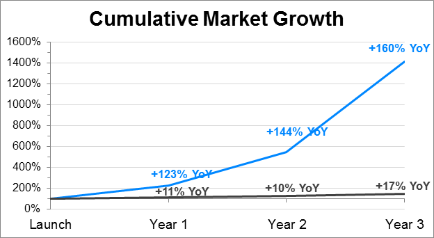
The impact is even greater when we examine market share for an industry. For instance, MotionPoint clients targeting Spanish speakers—and following these language-selection best practices—had a first-year market growth of 123%, compared to a mere 11% for those who only placed a link on the site.
By the third year, these successful clients experienced a total growth rate of 160%, while those who didn’t offer an intuitive solution grew only 17%.

Wrapping Up
The takeaway: To really optimize the user experience and reach the maximum value of your company’s global user experience, make sure you’re not adding unnecessary hurdles for your customers.
If your company’s brand strategy includes reaching new international markets, be sure those audiences are aware that you’re ready, and happy to serve them. When this message is clearly presented, and users know that they can trust your website, they’ll drive your brand’s exponential growth in their market.
Last updated on October 01, 2015